


Analysis report on the UX of the service Laurier Enrolment Services Web Page
Laurier Enrolment Services
Project Overview 📽️
This project focuses on re-designing the current Laurier Enrolment Services to provide easier navigation, usability and accessibility to students.
Timeline ⏰
January 2025-March 2025
My Role 👩🏽💻
Client 🏫
UX Research, Research Synthesis, Persona Development, Prototyping
Service Laurier

The Challenge
The challenges we found in the original Laurier enrolment services website was the overwhelming amount of information, complex structure, and unclear labelling.
Site structure and labelling made it hard for students to find what they were looking for which created frustration for users on the site.
The confusing navigation system made students struggle with completing simple tasks on the site. Many important information was buried under multiple layers causing students to stay on the site longer in order to find what they are looking for.
The Design Thinking Process
Empathize
Define
Visualize
Prototype
Test
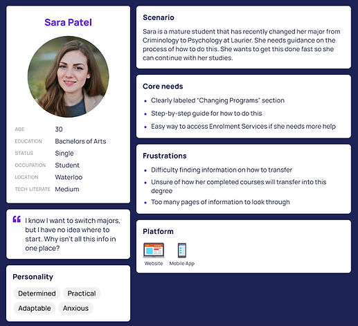
User Personas 👩🏽💻
We realized the challenges students faced when
navigating Laurier's enrolment services web pages, so I created user persona's to help us stay grounded in real students needs instead of designing for an average user.
Research 🔍
Research methods such as surveys, user interviews, usability tests, card sorting and tree testing were used to target where our users struggled the most, we got over 35 participants through our research.
Prototyping & Testing 💻
Our clients at Service Laurier did not want any kind of prototyping which is why we did more in depth UX research and data collection.
User Personas 👩🏽💻


Research and Design 🔍
Card Sort Results

-
We ran an open card sort with 11 participants, using 58 cards representing different pages and topic from the site
-
Participants created their own categories and group information on what made sense to them
Tree Test Results

-
The tree test showed that students were clicking the wrong section when looking for cross registration information
-
By placing it inside enrolment services, students will be able to see all the related options in section together
Usability Testing


We had 4 second year Laurier Brantford students do three tasks on the live enrolment services site while thinking out loud, and then we asked follow up questions…
1. Join a waitlist
2. Switch from part time to full time
3. Apply for Laurier's tuition and bursary program


